Everon
Everon
Everon is the brains behind electric vehicle charging.
It creates the software which facilitates the global revolution in electric mobility, and they asked us to create their new brand identity. So we set out to create a new look that captures the energy they put into moving society towards a more sustainable future. A future where transport is electric, emission free and intelligently connected – a message that has Positivity running right through it.
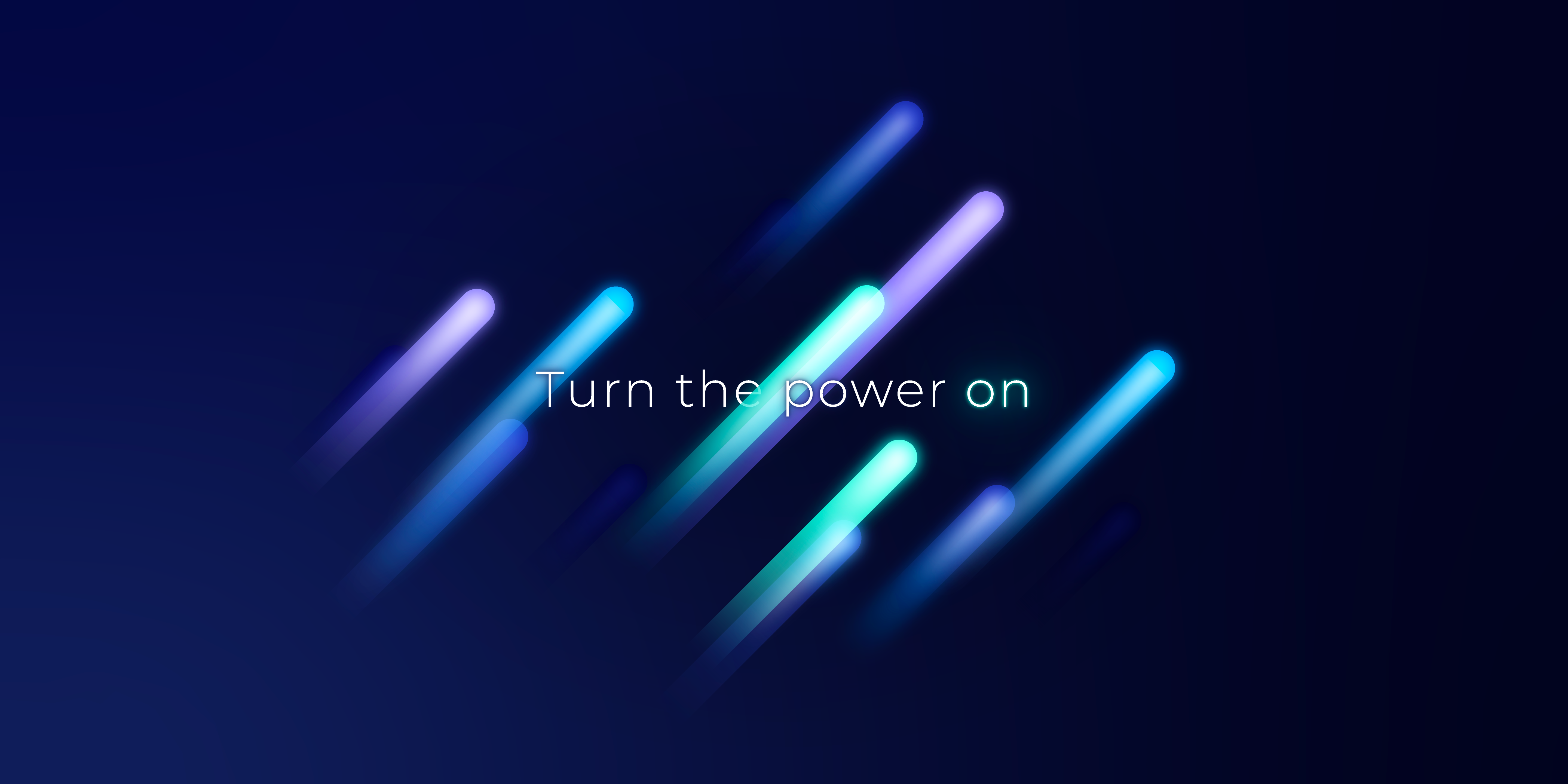
The new Everon ‘e-finity’ logo represents the platform’s boundless, seamless empowerment through electric charging – making a complex task look simple, clever, and continuous. The bold graphics express the interconnected mobility and dynamism that are enabled through Everon. Alongside the strong visual language we combined bright fresh colours with a solid deep blue in their new palette. This colour combination represents the platform’s reputation for innovation combined with the reassurance of highly dependable security – a bright, fresh look for a global leader in electric mobility.