Grapedistrict
Grapedistrict
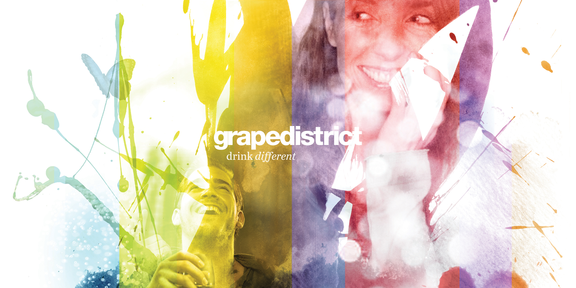
Building on the strengths of their previous identity, Grapedistrict asked us to evolve their identity further – this time adding some wine cues and emotion.
Touching everything but the original logo, our task grew to cover their retail graphics – signage, designing their webshop, and of course their wines and delivery boxes too.
The evolution used a combination of texture and typography- moving away from the sterility of the previous ubiquitous helvetica – to create more character and charm throughout the identity.
Their delivery boxes had to pack a punch too – and stand out in a crowd. Our brief was to help show that getting a delivery from Grapedistrict means you’re not just getting some wine delivered, but that you drink different.