Hands Off My Chocolate
Hands Off My Chocolate

The existing packaging design for Hands Off My Chocolate already had a cool style and personality, with strong visual elements that have helped launch the brand. However, the brand’s biggest asset – the distinctive round-blocked chocolate bar – was not communicated strongly on pack. So we were given the challenge to make the product the hero of the pack, supported by the kooky personality of Hands Off, build brand stand-out and increase the pack’s taste appeal.
Part of the solution was to simplify the logo so that the catchy Hands Off is leading with the ‘my chocolate’ as an integrated piece of support logo type. This makes the brand far more iconic, whilst creating space for the product photography.
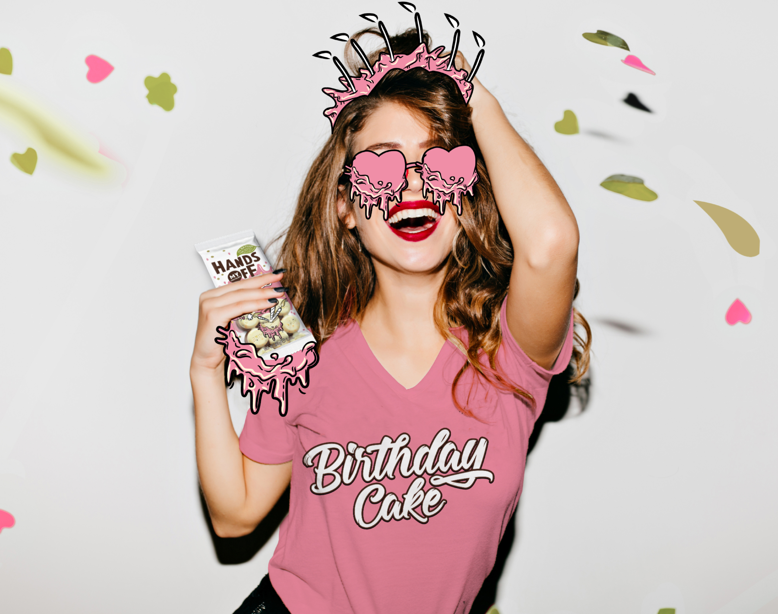
Our friends at Duivelseiland created the delicious product photography that is integrated with our funky illustrations, which were hand-drawn in-house.
We had so much fun on the pack design and illustrating the graphic language, that for our own casestudy we decided to develop the off-pack brand language to support these Vegan and non-Vegan delights. The joy, fun and taste speaks for itself, just like the brand. And remember, these bars and flavours are too delicious to share – so Hands-Off!

